|
|
 发表于 2010-5-7 09:05:36
|
显示全部楼层
发表于 2010-5-7 09:05:36
|
显示全部楼层
The Google design, turned up a notch5/06/2010 12:30:00 PM
This week we introduced our latest update to search, and I wanted to share a bit of our thinking on the design team. In short, we tried to take all the things we strive for at Google and make them better: powerful technology, snappy results, simplicity and a fun and quirky personality. Our goal was to take a design known by millions of people and make it better. As a designer, it’s hard to think of a more exciting challenge.
During our process we focused on people’s rising expectations for search. As the web has evolved over the past decade, people have been typing more sophisticated searches and seeking out specialized search tools to match. To keep pace with rapid change online, we have teams of engineers working across Google to develop new ways to present and refine search results. Our central challenge with our latest redesign was to figure out how to squeeze all these tools and technologies into a single page.
A common way to expand the flexibility of a website has been to add a left-hand panel of links, often referred to by designers as a “left-hand nav.” We’ve been creating mocks of left-hand panels since the earliest days of Google and have tested these designs with users as far back as 2006. Overall, we’ve found they can provide a great way to navigate without getting in the way of the main content, but they can also be distracting. Our users want more powerful tools, but they also want the simplicity they’ve come to expect from Google.
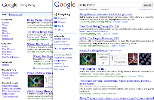
As a first step towards finding that balance, we introduced the Search Options panel last May, including a toggle to open and close. This way we could quickly try out new search tools, such as refinements by time and content types. Using the lessons from Search Options, designers, researchers and engineers worked side-by-side to explore a vast array of possibilities for a permanently open panel of search tools. We made hundreds of prototypes and gathered feedback from user studies, Googlers and through experiments — including one of our largest visible experiments ever. In the end, we came up with a design that provides dynamic, relevant search tools on the left, while lightening and updating the aesthetics all around. Here’s a picture of the Search Options panel (left) and our new results page (right):
We knew that adding a left-hand panel would inevitably add some weight to the results page, so we took a number of steps to lighten other aspects of the design. The overall visual redesign started with the Google logo. Here’s an image comparing the old logo (top) and the new logo (bottom):
 The new logo is lighter, brighter and simpler. We took the very best qualities of our design — personality and playfulness — and distilled them. The logo was the foundation for new icons and hundreds of tiny alterations designed to accommodate and seamlessly integrate the expanded functionality of the left-hand panel. For example, we lightened up the footer at the bottom of the page by removing the blue shading and the underlines on the links, lightening the color and expanding the search box. Here’s a picture of the old footer (top) compared with the new (bottom): The new logo is lighter, brighter and simpler. We took the very best qualities of our design — personality and playfulness — and distilled them. The logo was the foundation for new icons and hundreds of tiny alterations designed to accommodate and seamlessly integrate the expanded functionality of the left-hand panel. For example, we lightened up the footer at the bottom of the page by removing the blue shading and the underlines on the links, lightening the color and expanding the search box. Here’s a picture of the old footer (top) compared with the new (bottom):
 While I’m very happy about our latest improvements, a designer's work is never done. We’re already testing additional refinements and we'll continue to listen to all of you as we work to continue making search better. While I’m very happy about our latest improvements, a designer's work is never done. We’re already testing additional refinements and we'll continue to listen to all of you as we work to continue making search better.
If you’re curious, here are some of the other design prototypes we tried (you might have to click to magnify some of these images):
- Blue homepage: We’ve always had a strong affinity for blue — after all, blue is usually the color of web links, so it binds the web together. It became the basis for many designs.
- Blue button: The big blue button made it all the way to our first external experiment, where it was promptly rejected by users. We heard you loud and clear and changed the button in the next round.
- Universal bars: This design emphasizes different types of results with labeled blocks in the main results pane, such as books, news and shopping.
- Blue results: This is one of the final blue designs we created and marks the point when we renamed the "Web" link to "Everything" — a label that gets closer to the intent of our mission to organize all the world’s information.
Posted by Jon Wiley, Senior User Experience Designer
Permalink |
|

 发表于 2010-5-7 02:41:08
 大家发现了没有?


 发表于 2010-5-7 19:54:09